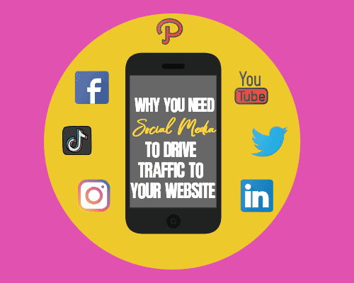
Every social media platform has different size suggestions for the graphics you post. They are continuously changing so it’s important to look at the platform you want to use so that you know the right sizes for everything from profile photos, headers, and ads.
It’s also important to read the terms of service regarding where you get images, how you alter them with text overlays and more. Outside of that, there are some general things that you should know about using social media graphics.
Use Plenty of White Space
If you make an image of any size too cluttered it won’t be very attractive. No one will know what your point was, and therefore won’t engage with it. Cleaner and simpler is often better depending on the message you’re trying to get across to your audience.
Choose Colors Carefully
Remember that people are typically on their mobile devices when they look at things. If the colors don’t match, or worse, clash, it can be painful to the eyes to the point that they can’t wait to click away and look at something else. If you’re not familiar with colors that look right together you can use a color wheel to help but you can also take a photo of something where you find the colors pleasing, upload it to a color checker, and then use the colors to match.
Understand the Rule of Thirds
This is an artist and photography trick that really works. When you’re creating a graphic no matter the size separate it into thirds both horizontally and vertically. Images that aren’t in the background should intersect with the intersection of each line. This will make your images more pleasing to the eye.
Pick the Right Size Fonts That Are Readable
Study how your audience is looking at the image including the platform in which they’ll be looking at it with. Each social media platform has a different look and feel. You’ll need to learn it so that you can make a good choice on fonts. They need to be large enough to read, and designed right so that they’re readable on a screen.
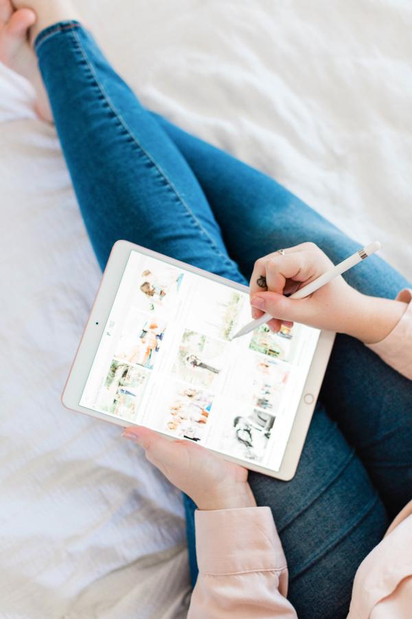
Use High-Quality Images
Don’t skimp on the quality of the images that you are using. It’s not worth it to get free images that look blurry or distorted. When choosing an image decide if the layout is right for what you’re going to use it for instead of trying to alter it too much. That way nothing will look blurry or off when you share them.
Social media graphics are important because you’ll get more shares with good images. Plus, it’s a way to brand yourself across all networks in a way that both is original and fits in with the platform that you’re using.